
Your Guide to Implementing Vue Placeholder Loading
Implementing placeholder loading in Vue.js has never been easier. Click for a step-by-step guide.


Originally published at renanfranca.github.io
In today's fast-paced digital world, user experience is paramount. As developers, we're always looking for ways to make our applications more responsive and enjoyable. One effective strategy to enhance the user experience is by using placeholder loading, or skeleton loading, in our Vue.js applications.
Placeholder loading is a technique where a simplified version of the web page is shown while the full content is being loaded. This approach gives users immediate feedback that content is on the way, resulting in a smoother, more engaging experience. But how do we effectively implement placeholder loading in Vue.js applications?
Enter placeholder-loading
An easy and efficient way to implement placeholder loading is through the placeholder-loading npm package. This simple and flexible library uses CSS-only content placeholders, providing a sleek loading animation.
To use placeholder-loading in your Vue.js project, you can install it via npm and import it into your application:
npm install placeholder-loading --save
@import "~/node_modules/placeholder-loading/src/scss/placeholder-loading";
This library allows you to modify various SASS variables to suit your project's aesthetics, such as direction, background color, border properties, grid configuration, and animation duration.
Using placeholder-loading is as simple as including specific classes in your HTML markup. Here's an example of how you can use it:
<div class="ph-item">
    <div class="ph-col-12">
        <div class="ph-picture"></div>
        <div class="ph-row">
            <div class="ph-col-6 big"></div>
            <div class="ph-col-4 empty big"></div>
            <div class="ph-col-2 big"></div>
            <div class="ph-col-4"></div>
            <div class="ph-col-8 empty"></div>
            <div class="ph-col-6"></div>
            <div class="ph-col-6 empty"></div>
            <div class="ph-col-12"></div>
        </div>
    </div>
</div>
In the above example, .ph-item, .ph-col-*, .ph-picture, and .ph-row are all classes provided by placeholder-loading. See some live examples here: https://zalog.ro/placeholder-loading/
A Practical Example
To better illustrate the use of placeholder loading in Vue.js, let's examine a real-world example from a pull request I recently made to the jhipster-lite repository on GitHub: add placeholder during load #6247.
In this pull request, I added placeholder loading to the LandscapeLoader and ModulesPatchLoader components. Those components are responsible for displaying a placeholder while the actual content is loading. To achieve this, I used the placeholder-loading library along with Vue.js components for rows, pictures, and lists.
Let's take a look at the Landscape screen using the LandscapeLoader:
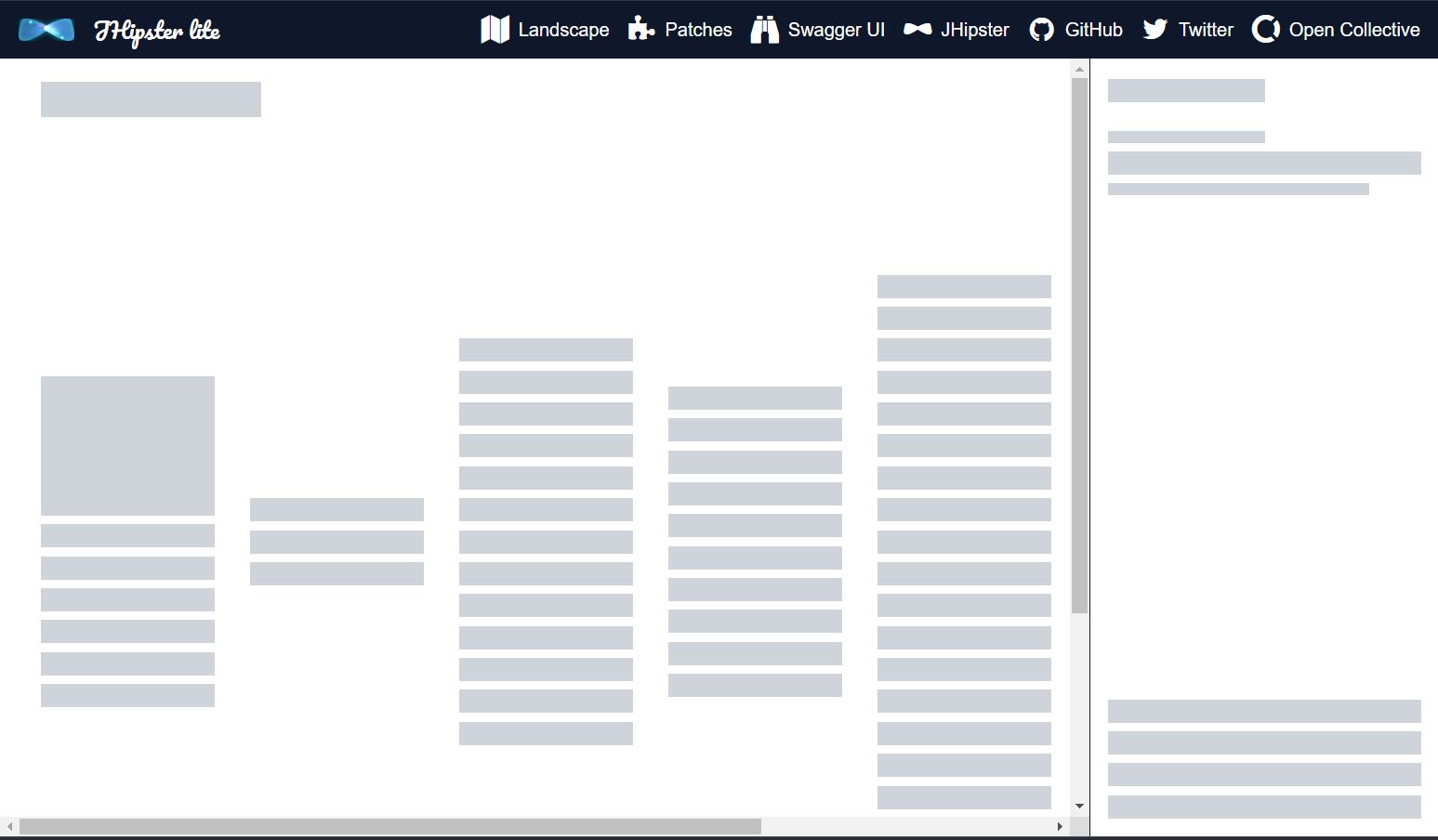
Landscape Skeleton Loading Screen
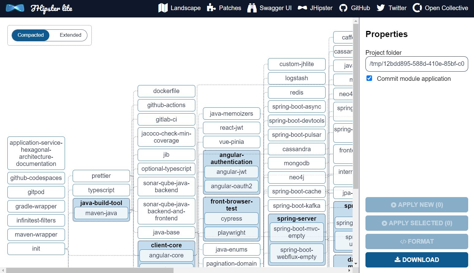
Landscape screen loaded
Here is the ModulePatch screen using the ModulesPatchLoader:
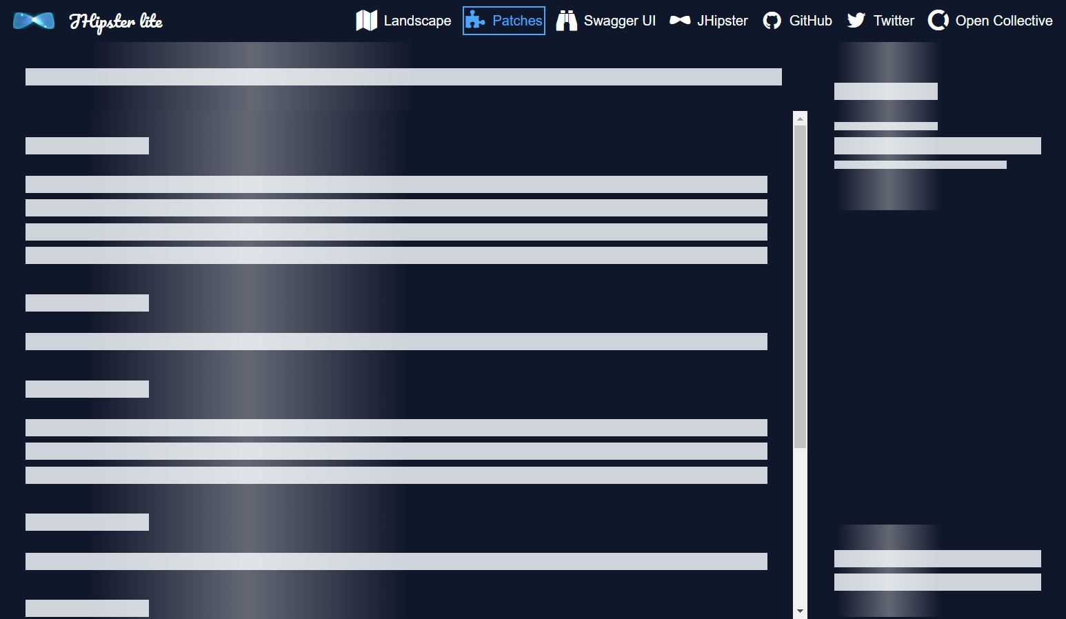
ModulePatch Skeleton Loading Screen
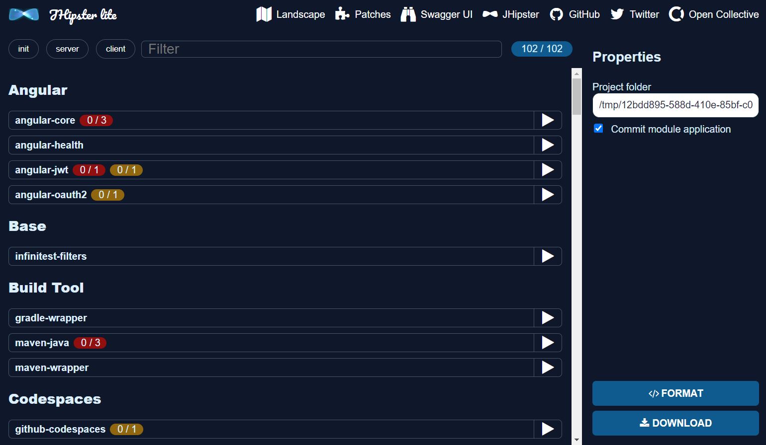
ModulePatch screen loaded
I choose to detail the implementation of the ModulesPatchLoader because it is easy to understand. Follow me through 8 steps to implementing it!
Step I: package.json
Here, I'd like to discuss a key change I made to the package.json file in a Node.js project. This file is crucial as it contains project metadata and the dependencies required for the project to function correctly.
Here is the modified code:
{
  "dependencies": {
    "axios": "1.4.0",
    "mitt": "3.0.0",
    "placeholder-loading": "^0.6.0",
    "vue": "3.3.4",
    "vue-router": "4.2.1"
  }
}
Line by line, let's break this down. The axios and mitt dependencies remained unchanged at versions "1.4.0" and "3.0.0" respectively. The vue and vue-router dependencies also remained consistent in versions "3.3.4" and "4.2.1".
The key change was the addition of a new dependency - placeholder-loading. This was introduced with a version specifier of "^0.6.0". This syntax is specific to npm, the Node.js package manager, and it indicates that npm will install the latest minor version that is greater than or equal to 0.6.0. For instance, if there are versions 0.6.1, 0.6.2, 0.7.0 available, npm will install 0.7.0. However, if there's 0.8.0, it would not install this as 0.8.0 would be considered a major version.
Adding the placeholder-loading package to the project's dependencies, allows the project to use the functionality provided by this package, which was critical to the enhancement I was working on.
Step II: vite.config.ts
Let's break down the changes I made in the code, line by line:
css: {
    preprocessorOptions: {
      scss: {
        additionalData: `
          @import "@/assets/global.scss";
          @import "@/assets/side-form.scss";
          @import "${path.resolve('node_modules/placeholder-loading/dist/css/placeholder-loading.min.css')}";`,
      },
    },
  },
In the css property, the preprocessorOptions is set to use SCSS, a CSS preprocessor which makes writing CSS more powerful and maintainable. The additionalData property allows us to add more SCSS resources.
The @import statement is used to import the styles from other SCSS files. The first two imports, "@/assets/global.scss" and "@/assets/side-form.scss", are from the original code and load global and side form styles respectively.
The new line I introduced imports the placeholder-loading.min.css from the placeholder-loading package, which is a framework for creating a placeholder loading effect. The path to the placeholder-loading.min.css file is resolved using Node's path.resolve method, which resolves a sequence of paths into an absolute path.
Step III: ModulesPatch.html
In the initial state of the code, a div element with classes "jhipster-modules" and "jhlite-loader-container" was used to display the loading state. This display was conditioned on the isLoading method of the content object. Inside this div, there was another div with the class "jhlite-loader" that presumably handled the actual display of the loading state.
<div class="jhipster-modules jhlite-loader-container" v-if="content.isLoading()" data-selector="modules-loader">
  <div class="jhlite-loader"></div>
</div>
<div class="jhipster-modules jhlite-menu-content-template" v-else data-selector="modules-list">
  <div class="jhipster-modules-list jhlite-menu-content-template--content">
    <div class="jhipster-modules-filters">
In the improved version of the code, the div has been replaced with a Vue component called ModulesPatchLoaderVue. This component is also dependent on the isLoading method of the content object to determine when to display. This change encapsulates the loading display logic within a reusable Vue component, making the code cleaner and more maintainable.
<ModulesPatchLoaderVue v-if="content.isLoading()" />
<div class="jhipster-modules jhlite-menu-content-template" v-else data-selector="modules-list">
  <div class="jhipster-modules-list jhlite-menu-content-template--content">
    <div class="jhipster-modules-filters">
Step IV: ModulesPatch.component.ts
Here's the modified code snippet:
import { ModuleParametersVue } from '../module-parameters';
import { castValue } from '../PropertyValue';
import { ModuleParametersRepository } from '@/module/domain/ModuleParametersRepository';
import { ModulesPatchLoaderVue } from '../modules-patch-loader';

export default defineComponent({
  name: 'ModulesPatchVue',
  components: { ModuleParametersVue, IconVue, TagFilterVue, ModulePropertiesFormVue, ProjectActionsVue, ModulesPatchLoaderVue },
  setup() {
    const alertBus = inject('alertBus') as AlertBus;
    const modules = inject('modules') as ModulesRepository;
  }
});
Starting from the top, the imports section of the code remained largely the same, but with the addition of one crucial line: import { ModulesPatchLoaderVue } from '../modules-patch-loader';. This line imports the ModulesPatchLoaderVue component, which was added as part of the solution to improve the page loading experience.
In the defineComponent function, the new ModulesPatchLoaderVue component was added to the components object. This means that the ModulesPatchLoaderVue component is now accessible within the ModulesPatchVue component, and can be used to display a more aesthetically pleasing loading placeholder when the page is loading.
The setup function remained untouched, but it's worth noting that it injects instances of alertBus and modules for use within the component.
Step V: modules-patch-loader/index.ts
The changes are straightforward - it imports the Vue component ModulesPatchLoaderVue from ModulesPatchLoader.vue and then exports it. Here's the code:
import ModulesPatchLoaderVue from './ModulesPatchLoader.vue';

export { ModulesPatchLoaderVue };
This kind of file is standard in JavaScript and TypeScript projects. It brings a significant improvement to the way we handle imports in our code. The magic lies in its ability to allow importing directly from the modules-patch-loader directory, without the need to specify the .vue file. This results in cleaner and more readable code. Here's how you can now import the ModulesPatchLoaderVue:
import { ModulesPatchLoaderVue } from '../modules-patch-loader';
This replaces the more verbose, previous method:
import ModulesPatchLoaderVue from '../modules-patch-loader/ModulesPatchLoader.vue';
By streamlining the way we import the ModulesPatchLoaderVue, we make our code more maintainable and intuitive to navigate, thereby enhancing our overall code quality.
Step VI: modules-patch-loader/ModulesPatchLoader.vue
The ModulesPatchLoader.vue file is a Vue Single File Component (SFC), essentially an all-in-one file containing a <template>, a <script>, and a <style> tag, each referring to an external HTML, TypeScript, and SCSS file respectively.
The <template> tag in this component points to the external ModulesPatchLoader.html file:
<template src="./ModulesPatchLoader.html"></template>
Next, the <script> tag links to the ModulesPatchLoader.component.ts TypeScript file:
<script lang="ts" src="./ModulesPatchLoader.component.ts"></script>
The <style> tag introduces SCSS styles that define the appearance of the component:
<style lang="scss">
.jhlite-modules-loader-content {
  background-color: $jhipster-lite-secondary-color;
  color: $jhipster-lite-primary-text-color;
  .ph-item {
    border: none;
    background-color: $jhipster-lite-secondary-color;
  }
}
.ph-jhlite-modules-container-content {
  display: flex;
  flex-direction: column;
  flex-grow: 1;
  flex-basis: 0;
  box-sizing: border-box;
  .modules-filter {
    height: 80px;
  }
  .modules-list {
    flex-grow: 1;
    overflow-y: auto;
  }
}
.ph-jhlite-modules-sidemenu {
  display: flex;
  flex-direction: column;
  min-height: 100%;
  box-sizing: border-box;
  &-top {
    flex-grow: 1;
    flex-basis: 0;
  }
  &-bottom {
    height: 110px;
    flex-grow: 0;
    flex-basis: auto;
  }
}
</style>
The .jhlite-modules-loader-content class sets a background color and a text color, while also adjusting the border and background color of items with the .ph-item class. The .ph-jhlite-modules-container-content class dictates the flexbox properties for layout control, and adjusts the height of the .modules-filter subelement and the overflow properties of the .modules-list subelement. Lastly, the .ph-jhlite-modules-sidemenu class manages the flexbox properties of the side menu, and manipulates the height and flexbox properties of its -top and -bottom subelements.
Basically, this SCSS mimics the positions of the elements from the ModulePatch screen.
Step VII: modules-patch-loader/ModulesPatchLoader.html
The ModulesPatchLoader.html is an HTML file that serves as a template for a Vue.js component. It sets up the structure of the component and uses Vue.js directives to create dynamic logic, like loops (v-for) and class bindings (:class).
div class="jhlite-modules-loader-content jhlite-menu-content-template" data-selector="modules-loader">
  <div class="ph-jhlite-modules-container-content jhlite-menu-content-template--content">
    <div class="modules-filter">
      <div class="ph-item">
        <div class="ph-col-12">
          <div class="ph-row">
            <div class="ph-col-12 big"></div>
          </div>
        </div>
      </div>
    </div>
    <div class="modules-list">
      <div class="ph-item">
        <div class="ph-col-12">
          <div class="ph-row" v-for="(row, index) in rows" :key="index">
            <div :class="`ph-col-${col.size} ${col.classes}`" v-for="(col, index) in row.columns" :key="index"></div>
          </div>
        </div>
      </div>
    </div>
  </div>
  <div class="jhlite-menu-content-template--menu">
    <div class="ph-jhlite-modules-sidemenu">
      <div class="ph-jhlite-modules-sidemenu-top">
        <div class="ph-item">
          <div class="ph-col-12">
            <div class="ph-row">
              <div class="ph-col-12 empty"></div>
              <div class="ph-col-6 big"></div>
              <div class="ph-col-6 empty big"></div>
              <div class="ph-col-12 empty"></div>
            </div>
            <div class="ph-row">
              <div class="ph-col-6"></div>
              <div class="ph-col-6 empty"></div>
              <div class="ph-col-12 big"></div>
              <div class="ph-col-10"></div>
              <div class="ph-col-10 empty"></div>
            </div>
          </div>
        </div>
      </div>
      <div class="ph-jhlite-modules-sidemenu-bottom">
        <div class="ph-item">
          <div class="ph-col-12">
            <div class="ph-row">
              <div class="ph-col-12 big"></div>
              <div class="ph-col-12 big"></div>
            </div>
          </div>
        </div>
      </div>
    </div>
  </div>
</div>
Let's go through the given code line by line:
<div class="jhlite-modules-loader-content jhlite-menu-content-template" data-selector="modules-loader">
Here, a div is defined with the class jhlite-modules-loader-content jhlite-menu-content-template and a data-selector attribute modules-loader. This serves as the root container for the module loader.
The next section is a container for the content of the modules. This is where the dynamic creation of the modules happens:
<div class="ph-jhlite-modules-container-content jhlite-menu-content-template--content">
The nested div elements provide structure and design to the modules:
<div class="modules-filter">
...
</div>
<div class="modules-list">
...
</div>
Inside the modules-list section, a Vue.js directive v-for is used to loop over an array rows. Each row in this array represents a row in the module list:
<div class="ph-row" v-for="(row, index) in rows" :key="index">
Inside each row, another v-for directive is used to iterate over the columns in the row. The class of the column is dynamically bound with the Vue.js :class directive, which allows different styling based on the properties of the col object:
<div :class="`ph-col-${col.size} ${col.classes}`" v-for="(col, index) in row.columns" :key="index"></div>
The final section defines a side menu, which is broken down into a top and bottom section. Each of these sections contains several rows and columns for displaying information:
<div class="jhlite-menu-content-template--menu">
  <div class="ph-jhlite-modules-sidemenu">
    <div class="ph-jhlite-modules-sidemenu-top">
    ...
    </div>
    <div class="ph-jhlite-modules-sidemenu-bottom">
    ...
    </div>
  </div>
</div>
Step VIII: modules-patch-loader/ModulesPatchLoader.component.ts
The ModulesPatchLoader.component.ts is a TypeScript file that exports a Vue.js component, which includes a setup function for creating reactive data. Additionally, several helper functions are used to generate columns and rows for the component.
import { defineComponent } from 'vue';

export default defineComponent({
  name: 'ModulesPatchLoaderVue',
  setup() {
    return {
      rows: [createCategory(4), createCategory(1), createCategory(3), createCategory(1), createCategory(2), createCategory(2)],
    };
  },
});

const createCategory = (modulesCount: number) => {
  const baseColumns = [createBigColumn(2), createBigColumn(10, true), createNormalEmptyColumn(12), createBigColumn(12)];
  const additionalColumns = Array(modulesCount - 1).fill(createBigColumn(12));
  const lastColumn = createBigColumn(12, true);
  return createRow(...baseColumns, ...additionalColumns, lastColumn);
};

const createColumn = (size: number, classes: string) => ({ size, classes });

const createBigColumn = (size: number, isEmpty: boolean = false) => createColumn(size, `${isEmpty ? 'empty ' : ''}big`);

const createNormalEmptyColumn = (size: number) => createColumn(size, 'empty');

const createRow = (...columns: any[]) => ({ columns });
Below is the breakdown of the code:
import { defineComponent } from 'vue';

export default defineComponent({
  name: 'ModulesPatchLoaderVue',
  setup() {
    return {
      rows: [createCategory(4), createCategory(1), createCategory(3), createCategory(1), createCategory(2), createCategory(2)],
    };
  },
});
In this section, the Vue.js component named ModulesPatchLoaderVue is defined using the defineComponent function from Vue. The setup function returns an object with a rows property. This property holds an array, each element of which is the result of the createCategory function with different arguments.
const createCategory = (modulesCount: number) => {
  const baseColumns = [createBigColumn(2), createBigColumn(10, true), createNormalEmptyColumn(12), createBigColumn(12)];
  const additionalColumns = Array(modulesCount - 1).fill(createBigColumn(12));
  const lastColumn = createBigColumn(12, true);
  return createRow(...baseColumns, ...additionalColumns, lastColumn);
};
Here, createCategory is a function that takes a modulesCount argument. It creates an array of baseColumns and another array of additionalColumns which holds several createBigColumn instances based on the modulesCount. It then combines these arrays into a single row using the createRow function.
const createColumn = (size: number, classes: string) => ({ size, classes });

const createBigColumn = (size: number, isEmpty: boolean = false) => createColumn(size, `${isEmpty ? 'empty ' : ''}big`);

const createNormalEmptyColumn = (size: number) => createColumn(size, 'empty');
createColumn, createBigColumn, and createNormalEmptyColumn are helper functions used for creating different types of columns. createColumn function creates a column object with size and classes properties. createBigColumn calls createColumn and adds a 'big' class string to it, optionally marking it as 'empty' based on the isEmpty argument. createNormalEmptyColumn creates an 'empty' column with a specified size.
const createRow = (...columns: any[]) => ({ columns });
Finally, createRow is a function that takes an arbitrary number of column objects and wraps them into a single row object.
By implementing placeholder loading in this way, we significantly enhance the user experience, providing immediate visual feedback while the real content is loading.
Conclusion
Whether you're building a simple blog or a complex web application, incorporating placeholder loading in your Vue.js applications can greatly improve user experience by providing immediate feedback during content loading. The placeholder-loading library is a flexible, easy-to-use tool for implementing this technique, as demonstrated by the pull request example.
I hope this post has shed light on the importance of placeholder loading 💡 and how to use the placeholder-loading library in your Vue.js applications. I hope you enjoyed this insightful guide 📖 on implementing Vue placeholder loading! To continue the conversation, I'd love to hear from you 🗣️.
Do you have experience using the placeholder-loading library in your own Vue.js applications? How has it improved the user experience? 👥 Or maybe you've faced challenges while implementing this technique, and you're seeking solutions or alternative methods. Share your stories 📚, ask your questions ❓, and let's learn together 🤝!
Drop your thoughts 💭 in the comment section below and let's foster a healthy discussion around enhancing user experiences in web development. Looking forward to your valuable input! 🌟
Lastly, let me extend an invitation to join me on my journey 🚀 in the realm of software development. I share my insights, experiences, and valuable resources on Twitter @renan_afranca 🐦 and LinkedIn 📎. Following me on these platforms not only keeps you updated on my latest posts and projects 📬 but also opens doors to vibrant discussions and learning opportunities. I look forward to connecting with you! 💼
🔥🚀 Ready to level up your coding skills and knowledge? 🚀🔥
🚀 Stepping into Vue - Enhancing the User Experience in JHipster Lite: Take a deep dive into the world of Vue and JHipster Lite and uncover ways to significantly uplift the user experience. Whether you're a developer seeking to boost your skills 🛠️, or a tech enthusiast intrigued by the potential of Vue, this post offers compelling insights that you simply can't afford to miss.
💰 How did I earn money to fix an issue from an Open Source Software (OSS)? Ever wondered if you can turn your passion for OSS into a revenue stream? This riveting post details one coder's journey to monetize their expertise, offering valuable tips, techniques, and motivation for anyone looking to follow a similar path.
🌐 Deploy jhipster monolithic (angular + spring boot) at fly.io for FREE: Looking for ways to deploy your jhipster monolithic application at no cost? Discover a step-by-step guide to utilizing fly.io for exactly this. Packed with useful advice, this post is a goldmine for any developer looking to deploy efficiently and effectively, all while keeping costs at bay.
Don't let this opportunity pass you by! Dive in now and unleash the wealth of knowledge these posts have to offer.